How design influences the success of a mobile app
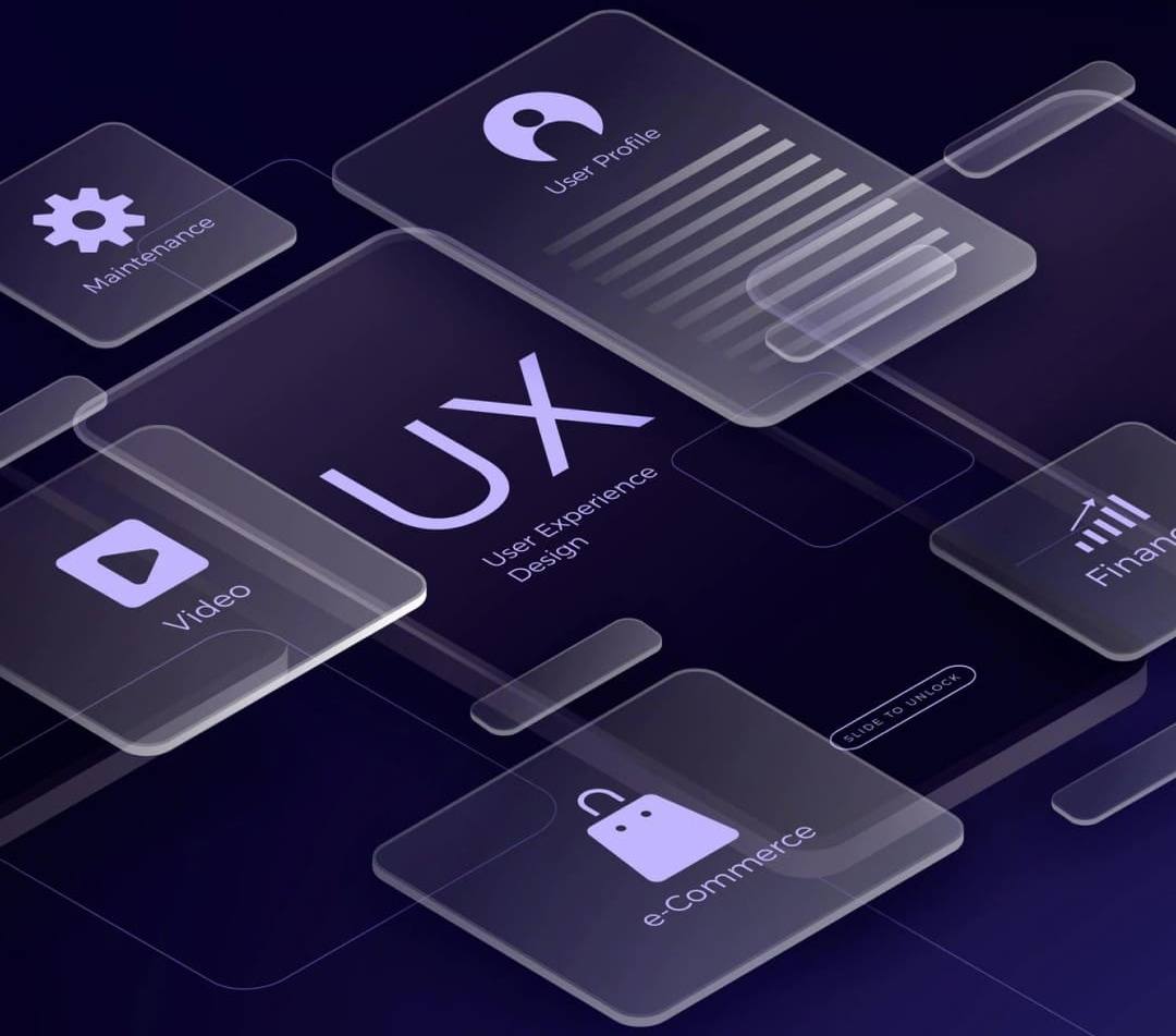
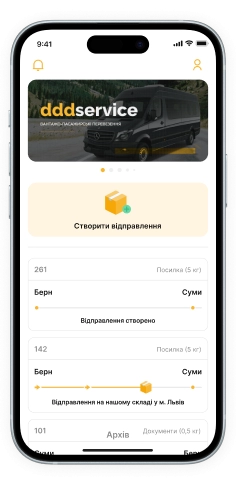
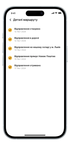
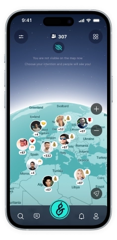
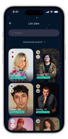
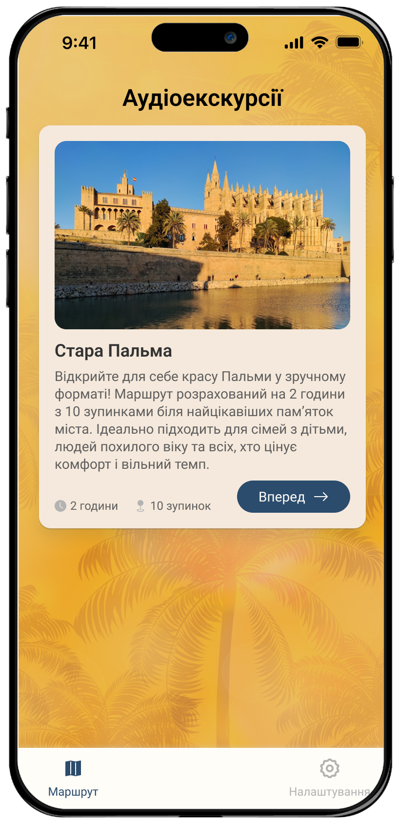
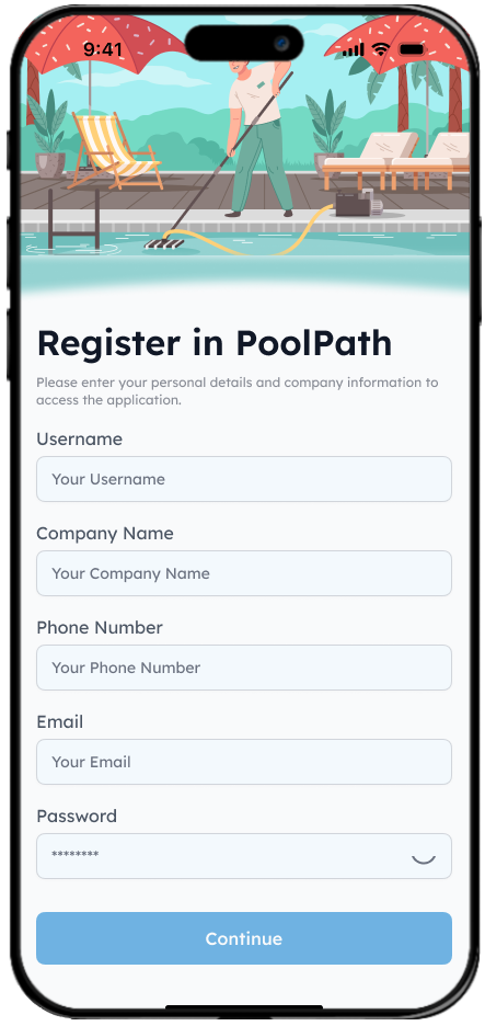
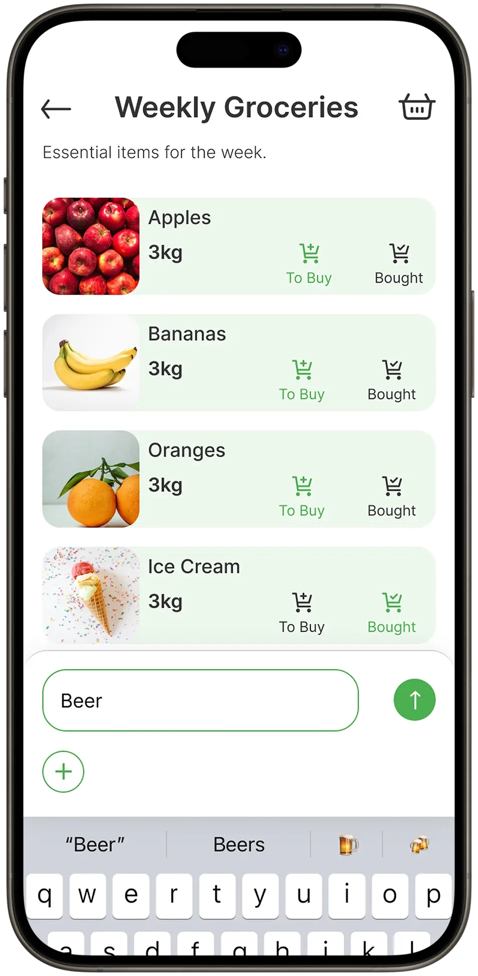
Application design is not just a set of pretty pictures.
Each interface element reflects the essence of the product and solves a specific problem: it attracts and retains the user’s attention, arouses interest and positive emotions, provides the audience with maximum comfort and encourages them to take targeted actions.
Our services include
- Design concept development.
- Creation of UI/UX design.
- Prototyping, interface testing.
The quality of the design of the mobile interface is one of the main criteria by which users evaluate the application.
UI/UX design development of a mobile application
What is a mobile application user interface? This term encompasses two components - the look and feel of the product and the way the user interacts with it. The audience expects not only an attractive, but also a convenient, intuitive and useful tool for solving problems. The role of the designer goes far beyond creating a beautiful visual. The specialist analyses the interface, works with the application structure, optimises the functionality - and only then begins the visual design of the project.
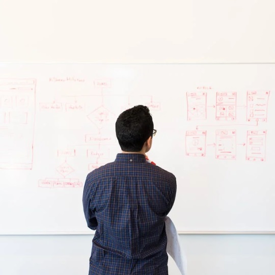
Create UX design
Creating a UX design means working out the structure, navigation and functionality of the application to provide a good user experience. At this stage, it is necessary to have a well-formed portrait of the target audience and understand its psychology – what it needs, what it expects from the application and how behavioural factors manifest themselves. Based on this, we outline the basic principles of user experience design:
- An intuitive interface that is easy for new users to understand;
- Logical and simple structure;
- Optimal functionality with which a person can solve their problems;
- Sophisticated chains for the implementation of different user scenarios;
- The simple paths from entering the application to performing targeted actions.
At this stage we do interface prototyping, create the application structure as a whole and each screen separately, develop interaction scenarios with the programme and reproduce all possible user reactions. In the final version, there should be no clunky elements, complicated ‘mazes’ or incomprehensible functions. For example, for a food delivery application or an online shop, the user should be able to quickly and easily understand the product range and proceed to the order form.
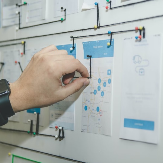
Development of user flow diagrams
User flow is a flowchart that shows the algorithm of the application. The traditional method of developing flowcharts is usually used: rectangles are screens, diamonds are checks for conditions, and arrows connect elements and show the direction of action. Drawing flowcharts gives a visual representation of the application and helps to solve such problems:
- form the correct structure and competently compare it with the functionality of the application;
- Evaluate and optimise any user scenario;
- Eliminate errors in the logic of user actions, detect problems when entering and leaving zones;
- Create and implement the shortest and easiest way to perform targeted actions;
- Optimise the number of screens;
- Add the missing sections without which the functionality of the application seems incomplete.
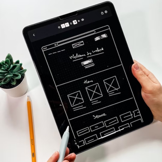
Sketching wireframes
Wireframes are sketches, diagrams or skeletons of the structure of the application screens without detailing the elements.
Wireframes show what the screen will look like and where the main components – menus, buttons, headings, etc – will be. We create wireframes quickly, so the designer can sift through dozens of options and choose the right one in no time.
Sketches are not the final version of the structure, but it is better to coordinate and make the main conceptual decisions at this stage to avoid future improvements and changes.
The sketch is made in black and white as a “skeleton” without drawing any design elements.

Create a prototype
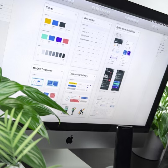
Based on the accepted design solutions, a prototype reproduces the application’s structure, functionality, navigation, the location of the target audience’s expectations and the relationship between sections. At this stage, the abstract idea takes on a clearer shape and the application logic becomes understandable and tangible. Once approved, the UI designer works with the prototype and the user interface elements take on colours and shapes.
Technically, we can create a prototype in two ways. The simplest is a static version where the structure of each screen is reproduced separately. The most visual is an interactive prototype with clickable elements. We can use the first way for simple applications with a typical structure and obvious logic. The second is for complex projects with a wide range of functionality and a unique structure. We use interactive prototyping in our work in the most informative and effective way.
We create clickable, interactive prototypes using software such as Figma, Invision, Principle, Protopie, Framer, etc. The level of complexity of the prototype can vary from a general demonstration of basic user scenarios to a full reproduction of micro-interactions, including animations, transitions and visual effects. We can draw the prototype screens schematically or in detail.
UI design development
All decisions made during the UX research phase should be packaged nicely and attractively. To do this, you need to create a UI design – the look and feel of the user interface. The designer works on the visualisation:
- Selects fonts and colour palettes;
- controls the appearance of buttons, icons, backgrounds, menus, forms and navigation elements;
- Creates visual effects, animations and transitions;
- renders all application screens in detail.
The result of this work is full-colour digital design layouts of the screens, which are sent for layout. It is at this stage that the mobile application takes on the final form that users will judge it by. UI and UX are inseparable design elements. It is undesirable to separate them and work on them separately. A team working on the UI/UX interface is the only way to get a holistic, optimised, effective product that meets the expectations of the target audience.
Mobile App Design Development
We develop mobile application design in several stages. Technical drawing of graphic elements is only a small part of a complex process. Our work is based on business analytics, the study of the target audience and competitors.
We formulate the main purpose of the application, the problems it solves, the results the customer wants to achieve.
We find out what style suits the direction of the business and what is relevant in the field today. We study the design of applications that are highly rated in the field, evaluate their pros and cons, and find the direction in which you can stand out from the competition.
We identify the target audience's age range, gender, interests, activities, hobbies, communication style, behavioural factors and other parameters. We create an overall design concept that focuses on user preferences.
We design user scenarios, create a Client Journey Map, and determine how the audience will interact with the elements of the mobile application and how they will achieve the desired actions. These paths should be clear, short and without distracting details.
Based on these decisions, we move on to creating a prototype that reproduces the principle of the application. Prototyping allows the structure and functionality to be adjusted before the code is written.
We think about the design style and choose the colour scheme, fonts, and placement of interface elements. We draw the appearance of the screens in graphic editors. The aim of this stage is to create an original visual image that is interesting and attractive to users.
TECHNOLOGIES


App design costs
How much does it cost to create an app? This is one of the first questions we hear from clients. The cost of design services is calculated individually after analysing the brief and depends on many factors:
 Application purpose
What tasks should the program solve, for what purpose it is created and how much it affects the business.
 Functional complexity
What options should be available to users, whether it is necessary to provide for further expansion and scaling of the product.
 Design requirements
Whether it is necessary to use complex animated objects, 3D graphics, unique design elements.
 Time of work
How quickly you need to implement the project, how many employees need to be involved in the development.
Order UX/UI design services
attract more target audience?
Mobile application will help you achieve these goals!
App design differences between iOS and Android
When developing interface design, developers use iOS and Android guidelines. Each operating system offers its own guidelines – documents with recommendations for application design developers. By following these guidelines, we solve two problems at once: we provide convenience for the user and ensure that the application meets the requirements of the chosen platform – all of which will have a positive impact on further promotion.
Projects developed according to the guidelines follow generally accepted basic standards used by users of a particular operating system. When users download each new application, they do not have to relearn the arrangement of menus and buttons; they interact with the mobile product intuitively.
Apple’s and Android’s design requirements are different, but there are common, unbreakable principles: applications should be convenient, intuitive and valuable to the audience.
Google’s Material Design principles
The Material Design guidelines we use to build Android applications. Google gives clear recommendations on how to design buttons, icons, animations, visual effects and transitions. A few key points:
- Tactile elements. The interface is made up of layers that can be compared to “digital paper”.
- Shadows. To make the elements feel real and tangible, they are superimposed and visually placed at different heights. Shadows, the central aspect of spatial navigation in Android applications, help to enhance this effect.
- Print style. Graphic elements are created according to the principles of printed matter, such as magazines and newspapers.
- Animation. All animated details and visual effects are understandable, meaningful and follow the laws of physics, making the interface as realistic as possible and involving the user in active interaction.
- Navigation. Not all Android smartphones have gesture control, so the application interface is designed for button control.
Apple Human Interface principles for iOS
The Human Interface Guidelines are Apple’s guidelines for developing iOS applications. Interface elements have a more complex design than Android. Basic principles:
- The interface should be as concise as possible and responsive to user actions.
- When drawing buttons, icons, backgrounds, gradients, blurs and “air” transitions.
- Attention is paid to micro-interactions that can accompany sounds, vibrations and animations.
- It is not recommended to use useless effects that take time but are of no value to the user.
- The design takes into account the principle of gesture control familiar to users of Apple devices.
The interface should match the purpose of the application: minimalism is welcome in business applications and games – a combination of bright colours and complex animations.
The differences between Apple Human Interface and Google Material Design are many:
- Controls (buttons, gestures), navigation bar;
- Displays notifications, action and cancel buttons;
- Search line, context menu, tab bar;
- Icon sizes, the minimum size of the click area;
- System fonts, scrolling effects and other options.
All of these principles can easily be taken into account when developing native applications for a single operating system. For cross-platform (hybrid) projects, additional decisions are made to ensure that the application displays correctly on both operating systems on iPhones and Android smartphones. In such cases, compromises must be made to ensure that the final product does not conflict with Apple and Google requirements.
Order high quality mobile application design
The professional development of a mobile application interface is an essential step in launching a successful project. Good design has many advantages:
- It attracts the attention of users and makes the product memorable to the target audience;
- differentiates the application from the competition;
- serves as a tool for the user to solve their problems;
- plays an image role and helps to build a loyal audience;
- builds trust in the product, the company and the brand;
- Increases transport efficiency;
- makes the application more popular, increasing the number of downloads and monetisation profits.
How do you develop an application interface that is popular and profitable? The best solution is to entrust this task to the professionals of the KitApp team. We provide turnkey mobile development, implement projects of any complexity and use the latest tools and technologies for interface design. You can see examples of our work in the website portfolio.
The cost of design development depends on the specifics of the application, its structure and functionality. We can offer the best solution for any budget – from simple minimalist options to large exclusive projects with many complex elements. Our applications are always unique, modern and effective.

